Snowhouse

Made Studio

We aimed to create a playful and memorable identity for SnowHouse, blending Korean-inspired charm, vibrant colors, and a refreshing visual experience.

Branding . Design . Conceptualization

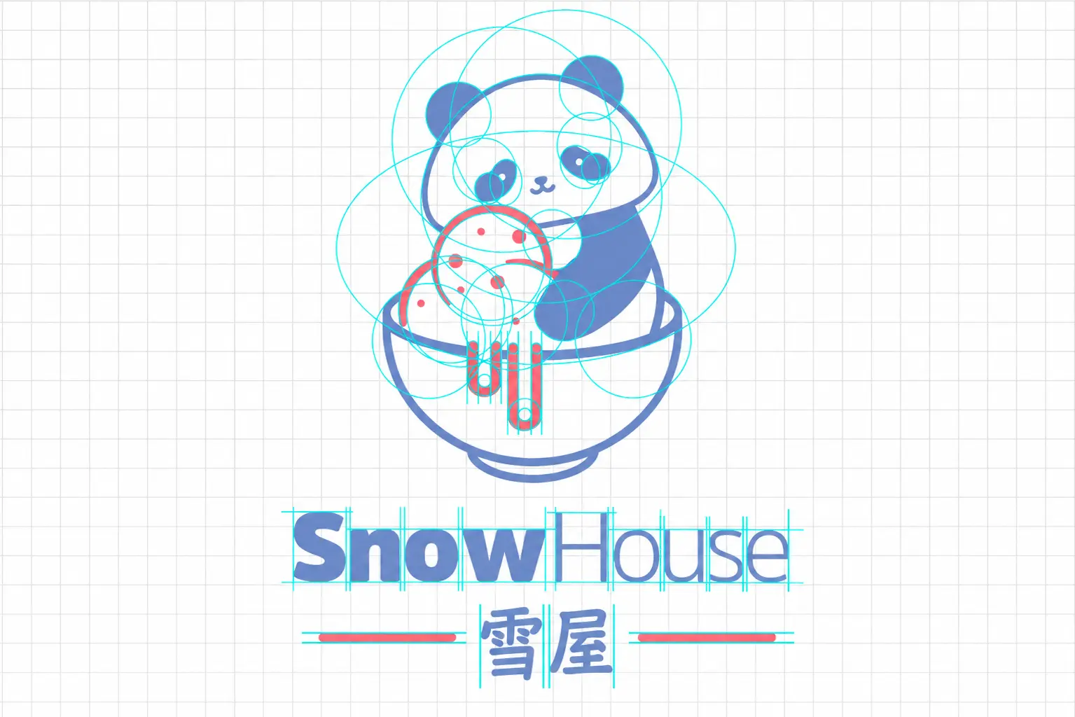
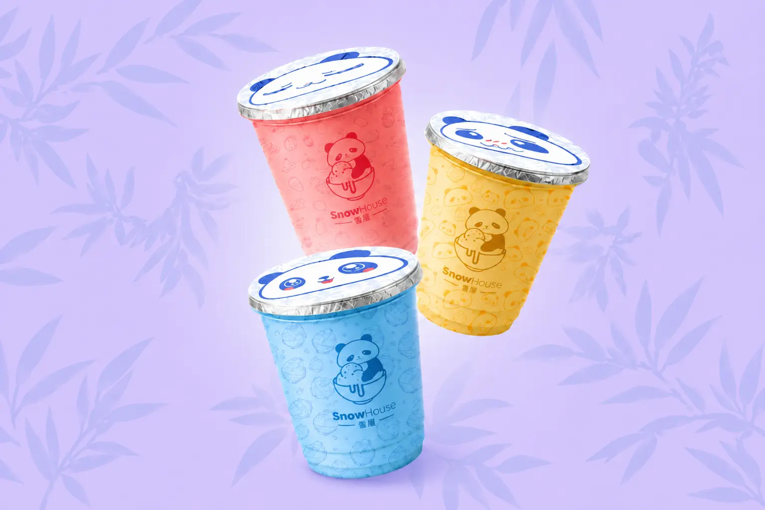
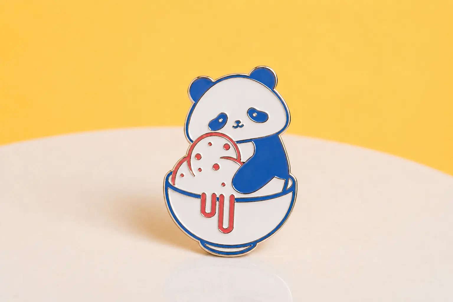
We developed the visual identity for SnowHouse, a Korean-inspired ice cream brand created to deliver a fresh, colorful, and memorable experience. Through a friendly panda character, vibrant color palettes, playful illustrations, and versatile packaging, we built a cohesive system that expresses the brand’s personality, connects with its audience, and transforms every product into a joyful moment.

The visual identity brings SnowHouse’s playful spirit to life, combining Korean-inspired charm, refreshing flavors, and a friendly personality that makes every interaction memorable.

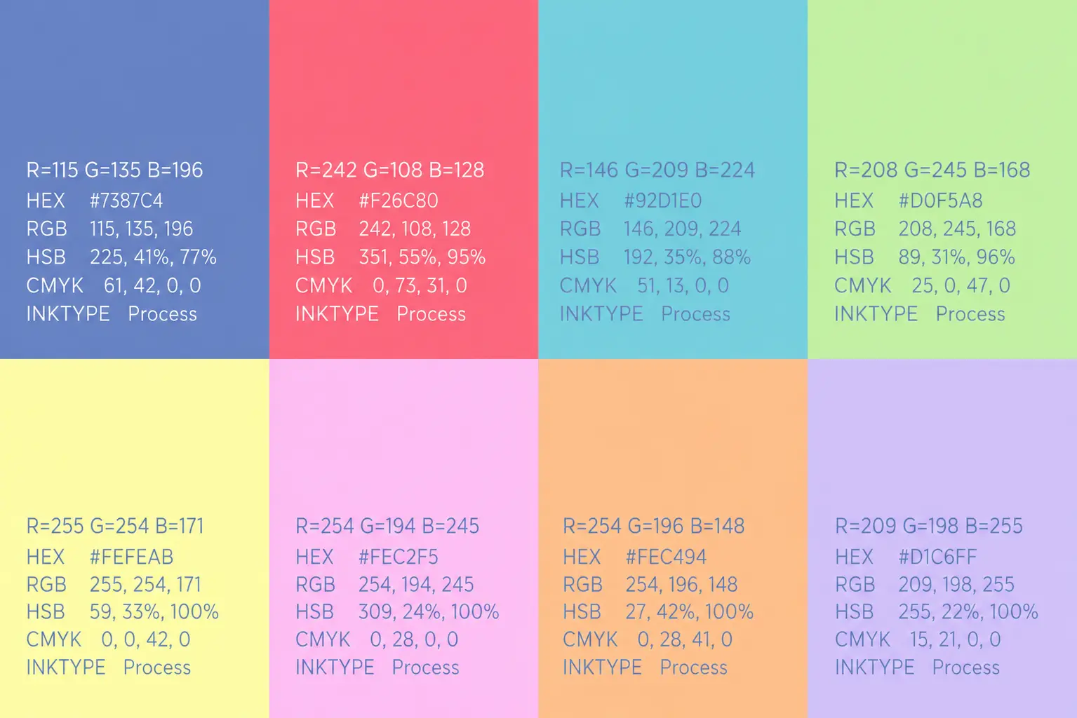
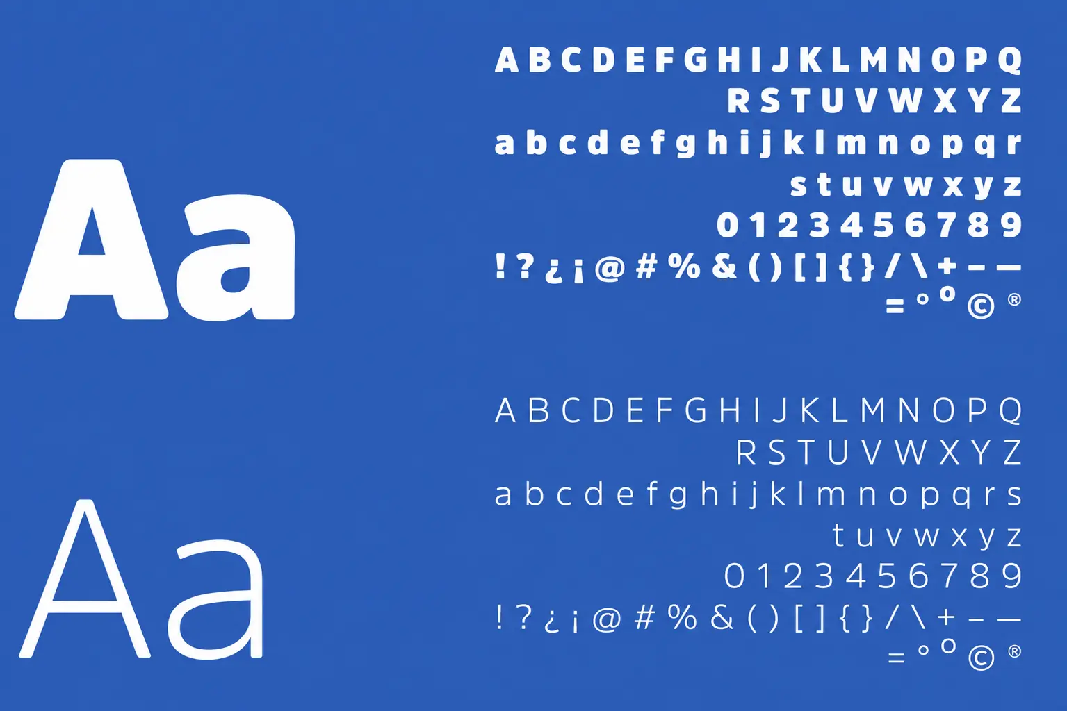
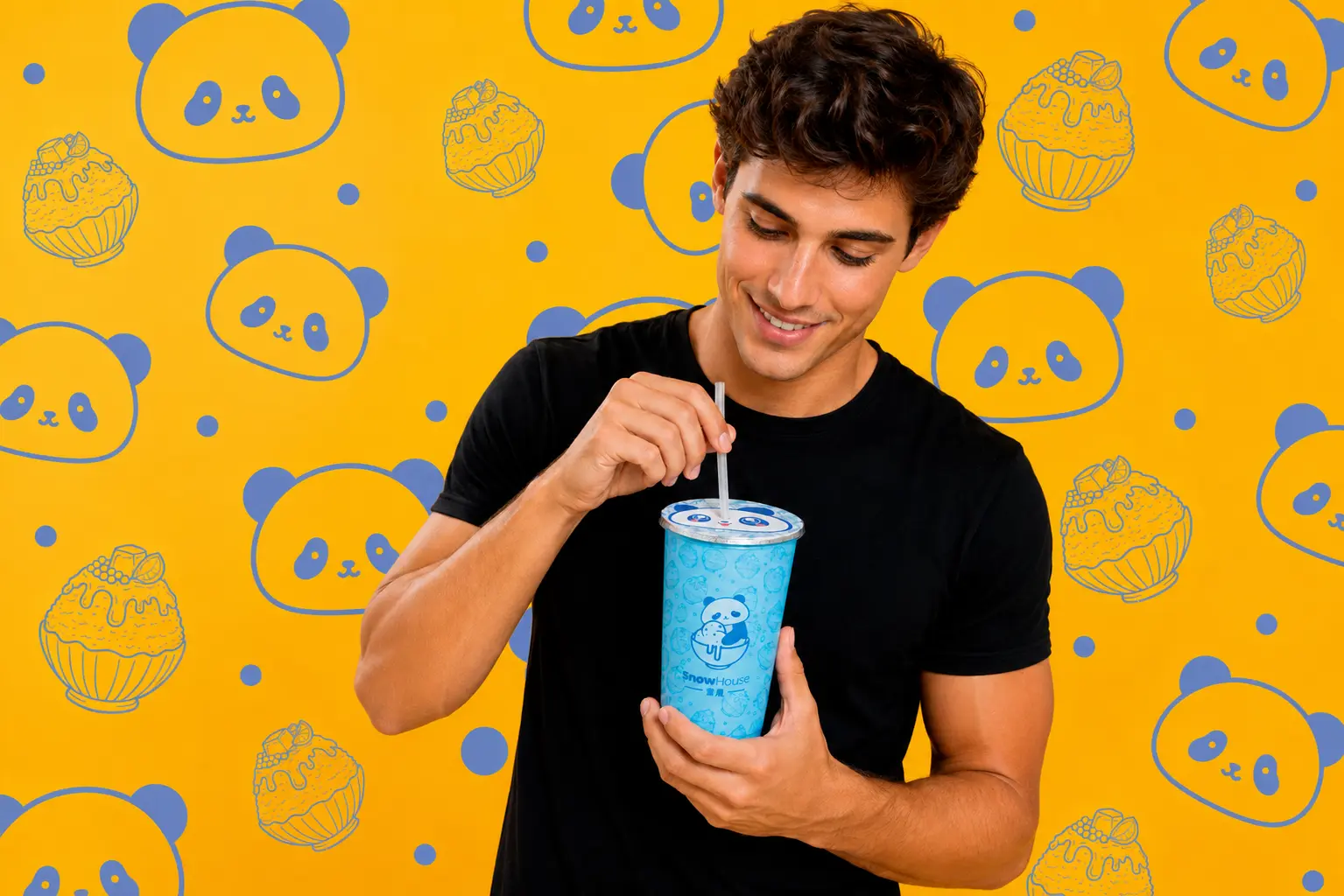
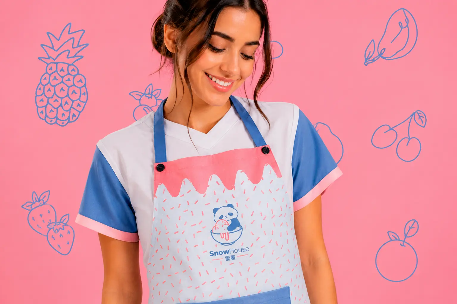
We developed a flexible visual language that combines vibrant colors, charming illustrations, expressive characters, and versatile graphic elements across the brand’s packaging and experience.

The resulting visual system creates a fresh and playful identity that brings consistency, personality, and a joyful spirit to every SnowHouse application.

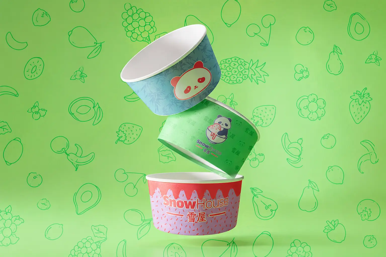
The result is a cohesive visual direction built through charming characters, vibrant colors, playful patterns, and a flexible system designed to adapt across packaging, uniforms, signage, and digital experiences.

Latest projects

Ready for more?
Let's talk

Every great link starts with a conversation. We are MADE for more, and we are here to ensure your journey with us is innovative, strategic, and successful.

Stay connected

Join our newsletter and stay updated on the latest trends in digital design

We work hand-in-hand with our clients co-creating and co-innovating solutions that build real connections with your audience.